4. CSS, responsive design, accessibility
Styling with selectors and combinators
Cascading Style Sheets, or CSS for short, defines the outlook of HTML by specifying properties, such as colors, sizes, position, etc. There are three ways of settings CSS attributes for elements:
styleattribute inside an element- a separate
<style>element inside the document - a separate CSS file that is linked to the HTML document with a
<link>element
Loading style sheets from separate CSS files that are linked in the <head> element is preferred - one file can be used on multiple pages, that is, changing the styles in the CSS file will be reflected on all the HTML documents using it. The style attribute inside an element can sometimes seem easiest, especially when modifying styles through JavaScript, but runs the risk of repeated code and can lead to code-rot really easily.
Using the style attribute is quite straight-forward:
<p>Some text and <span style="color: blue;">some blue text</span></p>
With the <style> element, you need to use selectors:
<head>
    <title>A simple page</title>
    <style> h1 { border-bottom: 2px solid black; }</style>
</head>
As well as with a separate CSS file. Those are linked to the document with the <link> element:
<html>
    <head>
        <title>A simple page</title>
        <link rel="stylesheet" href="my_awesome_style.css">
    </head>
    <body>
        <h1>Some content</h1>
    </body>
</html>
CSS rule syntax
Syntax of a CSS rule is SelectorList {declaration}.
/* General rule */
selector[, selector] {
  [property: value;]
}

/* The same rule targeted at several elements */
/* Headers blue */
h1, h2 {
  color: blue;
}

/* Several rules targeted at the same element */
/* Page with black text on yellow background */
body {
  color: black;
  background-color: yellow;
}
CSS as a list of style rules
Style declarations can be done, for example, for everything,
* {
    color: black;
}
just the p elements,
p {
    font-family: serif;
    color: #0000FF;
}
just the a elements that have a class main.
a.main {
    font-size: 20px;
    padding: 10px;
}
<a href="index.html" class="main">Home page</a>
<a href="about.html" class="main">About us</a>
<a href="other.html" class="other">Other Links</a>
<!-- last link will not be affected -->
The most commonly used selectors in CSS are class, id, and tag.
class attribute is targeted with a period (.) preceding the class name in CSS.
/* paragraphs with info class are italic */
p.info { font-style: italic; }
id attribute is targeted with a hash (#) preceding the id in CSS.
/* div with the id 'notice' has red borders */
div#notice { border: 1px solid red; }

/* Since only one element with id 'notice' exists
leaving div out of the selector is preferred. */
#notice { border: 1px solid red; }
Warning
id should be unique on a page. There should never be more than one element with the same idon the same page.
tag types are the HTML elements.
/* Add underline to all h1 elements */
h1 { text-decoration: underline }
When using classes as selectors, the class selector can be also used without an element. This results in that any elements with that class is then affected. With the rule:
.green_text { color: green }
both h1 and span - and any other element with the class of green_text - will be affected.
<h1 class="green_text">Ugly green Heading</h1>
<p>Lorem ipsum <span class="green_text">sit dolor</span> amet.</p>
Question
Is green_text a good class name? If the point of green_text is to emphasize or brand some content, what if your boss then tells you that from now on, the company will brand itself with shades of orange? It would not be ideal to have in the HTML a class of green_text that in the CSS would set the color: orange;.
Selector chaining
You can also chain these selectors for more specificity. For example, dot-concatenated classes target elements having all the listed classes defined:
p.old.python_code { text-decoration:line-through; }
<p class="old python_code">print "Hello world!"</p> <!-- affected -->
<p class="new python_code"> print("Hello world!")</p> <!-- not affected -->
Note the space between old and python_code in HTML.
Multiple tag types, classes, and ids can be selected with a comma:
/* Affects all h1, h2, and h3 elements */
h1, h2, h3 { font-family: serif; }
Combinators
And finally, combinators can be used to further specify elements.
Descendant combinator (" ") selects all elements contained inside the parent.
/* All li elements inside element with "important" id */
#important li { font-weight: bold; }
Child combinator (">") select immidiate children of the parent element.
/* All h2 that are immediate children of element with id of content */
#content > h2 { font-weight: bold; }
Sibling combinator ("~") selects any elements that share the same parent after the first selector.
/* Any p that share the same h1 parent with h1 that are after h1 */
h1 ~ p { font-weight: bold; }
Next sibling combinator ("+") selects the element which is immediately after the defined sibling.
/* Selects p elements that are immediately after h1 */
h1 + p { font-weight: bold; }
Pseudo-elements
Pseudo-elements may be appended to a selector. They affect specific parts of the elements in target, that is, p::first-line will affect the first lines of paragraphs. In CSS3, double colons ("::") are used to distinguish pseudo-elements from pseudo-classes (":"), coming next.
The pseudo-elements are:
::first-letter::first-line::after::before::selection(non-standard)
::after and ::before pseudo-elements fit well with the content property. A content property can be used to insert new content into a page in combination with pseudo-elements:
/* Will insert the word Chapter and a
space before any text inside h1-element */
h1::before  { content: "Chapter "; }
| Extra: See Mozilla Developer Network for examples and details.
Pseudo-classes
Pseudo-classes affect elements with a specific state. They are marked with a single colon (":"), for example, :hover.
/* this link changes color when the mouse is over it */
a.special_link:hover { background-color: white; }
Some selected pseudo-classes are:
:active- e.g., element has focus:visited- e.g., this link has been clicked before:hover- e.g., mouse cursor is currently over this element:enabled- e.g., this input element is not disabled:first-child- e.g., first child element of this element:nth-child(aN+b)- an order number or formula, e.g., 4N = every fourth
| Extra: All pseudo-classes listed at Mozilla Developer Network.
Style declarations
Color values
There are multiple ways to define colors in CSS. The following are all the ways to color an element's text (the same) red.
element { color: red } /* named values */
element { color: #f00 } /* hex values (short-hand) */
element { color: #ff0000 } /* hex values */
element { color: rgb(255,0,0) } /* r(ed), g(reen), b(lue) as bytes */
element { color: rgb(100%, 0%, 0%) } /* r(ed), g(reen), b(lue) as percentages */
element { color: hsl(0, 100%, 50%) } /* h(ue), s(aturation), l(uminance) as precentages */

/* 50% translucent */
element { color: rgba(255, 0, 0, 0.5) } /* 4th value is alpha [0...1] */
element { color: hsla(0, 100%, 50%, 0.5) }
| Extra: Mozilla Developer Network - Color.
| Extra: Mozilla Developer Network - Color values.
Fonts, font-family
font-family declarations control what fonts are used for the selector. Its value is a comma-separated list of fonts (a font stack) that should have a generic family as the last item.
If the first font on the list is not found, the one is tried until a font is found. The generic families for the fonts are serif, sans-serif, monospace, cursive, and fantasy.
/* if the client has 'Gill Sans', we'll use that. If not, check for
Georgia and 'Times New Roman'. If none are found, just use whatever
font with serifs that the client has installed. */

p.ingress {
    font-family: "Gill Sans", Georgia, "Times New Roman", serif;
}
| Extra: Mozilla Developer Network - font-family.
Other aspects of fonts that can be declared:
font-style- normal, italic, oblique
font-variant- e.g., normar, small-caps
font-weight- normal, bold, bolder, lighter, 100 - 900
text-decoration- e.g., none, underline, line-through
There are various ways for defining font-size:
- Absolute sizes:
- xx-small, x-small, small, medium, large, x-large, xx-large
- Relative sized:
- smaller, larger (relative to parent font size)
- Length values:
- px, pt
- Percentages:
- e.g., font-size: 80%;
How text is formatted is controlled by text-align, text-indent, line-height, and vertical-align:
text-align- left, right, center, justify
text-indent- (length), (percentage)
line-height- normal, (number), (length), (percentage)
vertical-align- baseline, sub, super, top, text-top, middle, bottom, text-bottom, (length), (percentage)
Combined, the text styles could be, for example:
p.ingress {
  font-family: "Gill Sans", Georgia, "Times New Roman", serif;
  font-style: italic;
  font-variant: normal;
  font-weight: bold;
  text-decoration: none;
  font-size: 12pt;
  text-align: justify;
  line-height: 1.2;
  vertical-align: baseline;
}
Video: Using browsers dev tools to inspect and modify styles
Specificity / cascading
So, you set some styles, but the end result does not look like how you anticipated? There are a few rules to solving style conflicts:
- Specificity: selectors have a certain specificity value. The rule with the most specific selector "wins"
- Cascading (location): when several rules have the same specificity value, the rule that was specified "last" wins
- Inheritance: some properties are inherited from their parent. But not all.
Specificity formula
When multiple styles overlap, the ascending order of specificity defines the end result (the strongest last):
| Selector | Specificity |
|---|---|
| Type, pseudo-element selectors | 1 |
| Class, pseudo-class, attribute selectors | 10 |
| Id selector | 100 |
| inline style attributes | 1000 |
The specificity is a sum of the specificity values. For example:
p::after                 //1(type)+1(pseudo-element) = 2
[type=email]             //10(attrib. selector)      = 10
p.important              //1(type)+10(class)         = 11
aside.chart:first-child  //1 + 10 + 10               = 21
!important overrides the cascading properties. To be used if no better way exists. For example, in the case of an external CSS, which you cannot control.
Warning
It might be tempting to solve all your CSS issues with !important, but this would only push the issue to another level, where the majority of rules start to have it.
Cascading order
| Origin | Importance (the strongest last) | |
|---|---|---|
| 1 | user agent (same as browser defaults) | normal |
| 2 | user agent | !important |
| 3 | user | normal |
| 4 | author | normal |
| 5 | CSS Animations | (refer to links below) |
| 6 | author | !important |
| 7 | user | !important |
In case of equal specificity, the latest declaration applies.
Some caution is needed not to override, for example, font families with comic-sans by !important, thus obsoleting the hard work of a CSS designer.
| Extra: Mozilla Developer Network - Specificity.
| Extra: Mozilla Developer Network - Cascading.
Inherit
inherit value in declarations means that the value is the same as it is in the parent element.
For example, the border is not inherited but the color is: when you want the text on a page to be blue one rule for the body suffices, whereas border for a list (ul element) does not influence its children. However, a property can be changed to be inherited. Notice that properties can have initial values (for color, it can be transparent).
inherit is an allowed value for every CSS property.
| Extra: Mozilla Developer Network - inherit.
!important
All the rules previously assigned to an element can be overridden by writing !important after a rule. This is to be used in special situations only. For example, visually impaired users may write a rule in the user style sheet (browser file userContent.css)
body {
  font-size: large; !important
}
Because of this, it should not be used as a quick workaround, even if tempted to do so.
How to approach CSS
Take advantage of the cascading and do not try to be too clever.
"Debugging is twice as hard as writing the code in the first place. Therefore, if you write the code as cleverly as possible, you are, by definition, not smart enough to debug it." –Brian Kernighan
.article #comments ul > li > a.button {
    /* Crazy town */
}
CSS gets easily scattered. Because of this, it is advisable to keep selectors general and use specific selectors only when they are really needed. The higher specificity selectors you use, the more difficult maintaining your style sheet becomes.
| Extra: Tricks on spotting bad CSS - CSS-Tricks.
Box model
Every element in an HTML document is represented as a box that has four edges: content edge, padding edge, border edge, and margin edge.
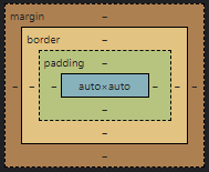
In the box model, the children try to be as wide as the parent allows them to be, while the parent element aims for a minimum height that fits all children.
Margins are always transparent. Horizontal margins don't overlap (collapse), while vertical (top and bottom) margins can collapse. Let's illustrate this with the following example: we have two elements, the first has a margin on the bottom 10px and the other has a margin on the top of 5px. The first instinct might be, that the margin between these two elements is 15px. However, the vertical margin collapses, resulting in a margin of only 10px.
h2 { margin-bottom: 10px; }
p { margin-top: 5px;}
<h2>Collapsing Margins</h2>
<p>The margin between this paragraphs and
the heading above would be 10 pixels, not 15.</p>
So, vertical margins collapse, while horizontal margins sum up.
Padding is the area surrounding the content box that shares its background.
Both padding and margin can be used to add "breathing room" around an element. The padding adds the extra space inside the (possible) border "stretching" the (possible) background, while margin adds the space outside the (possible) border and does not "stretch" the (possible) background. Of course, both properties can, and ofter are, used in the design.
Border is a border between padding and margin and has color, width, and style:
/* These two are equivalent */
h2 { border: 3px solid #FF0000; }
h2 { border-width: 3px; border-style: solid; border-color: #FF0000; }
When setting margins, padding, or borders, you have many different ways of setting the same properties, depending on the level of control you require. Let's look at a few examples:
/* 5px all around */
margin: 5px;
/* 5px on [top,right,bottom,left], no changes for others */
margin-top: 5px;
/* 10px for the top and bottom, 1px for right and left */
margin: 10px 1px;
/* 5px for the top, 4px for the left and right, 3px for the bottom */
margin: 5px 4px 3px;
/* 1px for the top, 2px for the right, 3px for the bottom, and 4px for the left margin */
margin: 1px 2px 3px 4px;
/* 5px top and bottom, horizontally center the element within its container (assuming a width is also set) */
margin: 5px auto;
Position on the page
Without position or display declarations, the content flows from left to right, and from up to down. This is known as the normal flow. Elements are put laid out as densely as they fit by their default behavior.
Inline elements go with the flow. Think of an <a>, <em>, or <span>.
Block elements assist in grouping the flow in separate sections. Think of a <div>.
In the z or depth direction, elements are positioned static by default (z-index of zero).
This normal flow is disrupted by the use of position, z-index, float, or display.
Inline & block
Elements are divided into inline and block elements.
Inline elements, such as <span> and <a>, occupy only the space needed and flow like the text from left to right without generating line breaks.
Block elements, such as <div> and <p>, inhabit the entire width of their parent element. Typically, there is a new line inserted before and after them. Height can be set also as more or less than the elements occupy. If the height of the element is set as less than the height of its content, overflow occurs. Overflow can be controlled using the overflow property (e.g., hide overflow, allow content to exceed container, show scrollbars).
Elements can be changed from inline to block and vice versa with the display declarations.
/* Would insert line breaks before and
after links with the class menu_item */
a.menu_item { display: block; }
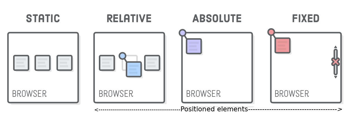
Position
The position of an element can be set with a position attribute. It can be set as:
| Position | The element is positioned... |
|---|---|
static |
as in normal flow |
relative |
relative to its "normal" position |
absolute |
relative to the nearest positioned ancestor, or if there is no positioned ancestor, to the container of the document |
fixed |
relative to the viewport. It has the effect of keeping the element in the same position in the window even when scrolling |
sticky |
A mixture of relative and fixed positioning. Not supported in IE |
The position declaration can be accompanied by top, bottom, left, right to tell the new location.
For example:
/* I will always stay at the top left corner of the viewport */
p.annoying_notice {
    position: fixed;
    top: 20px;
    left: 20px;
}

/* I will be 20 pixels lower and 20 pixels to
the right of where I would be without this style */
p.side_note {
    position: relative;
    top: 20px;
    left: 20px;
}
| Extra: Mozilla Developer Network - Position.
Z-index
When location (in x, y) is forced, elements may overlap.
In these scenarios, the z-index tells how the elements should be layered, that is, which is on top, and which is below which - the greater the number, the nearer to the user the element is. The z-index must be an integer, but it can also be negative. With equal z-indices, the latest is the foremost, that is, the element that comes last in the HTML.
static implies a z-index of zero, other positions are z-index of one.
Floats
float is a common declaration to position images besides text, that is, to make the text flow around the image on either side. Together with float, comes also clear, which can be used to force the flowing content to start only after the float has ended.
float: left|right|none;
clear: left|right|both;
"A float is a box that is shifted to the left or right on the current line. The most interesting characteristic of a float is that content may flow along its side (or be prohibited from doing so by the clear property)." CSS2 specification on floats.
In the example above, the last paragraph of text clears the float, thus making it start only after the floated image has ended. As novice web developers, removing items from the normal flow can sometimes cause confusion. Luckily, many browsers offer dev tools, which highlight the bounds of selected elements. This can be used to check the factual bounds of floated elements.
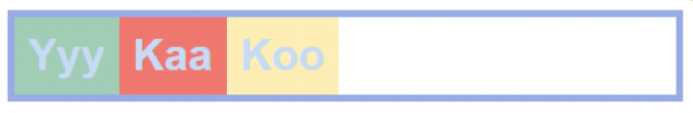
Flexbox
Flexbox is a display declaration, that allows for easier implementation of flexible layout. Elements are laid out within their parent flex container, that is, an element with display: flex. In flexbox-land, the elements can be placed in both horizontal and vertical directions. These are referenced as the main axis and the cross axis, while the direction can be changed using flex-direction.
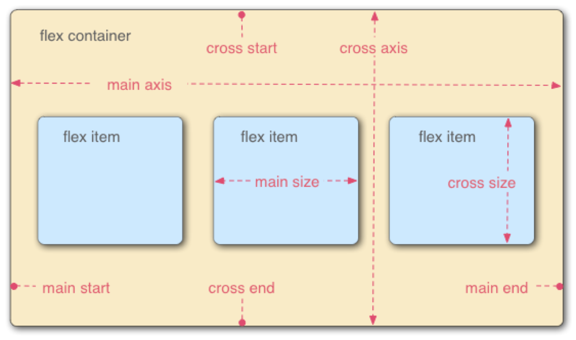
The flex-direction can be set as either row, row-reverse, column, or column-reverse.
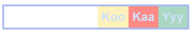
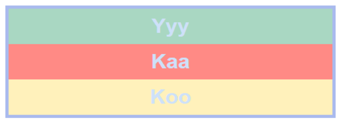
<div class="container">
  <div class="flex-item">Yyy</div>
  <div class="flex-item">Kaa</div>
  <div class="flex-item">Koo</div>
</div>
div.container {
  display: flex;
}
div.container {
  display: flex;
  flex-direction: row-reverse;
}
div.container {
  display: flex;
  flex-direction: column;
}
Items can be spread around the main axis with justify-content: flex-start | center | flex-end | space-around | space-between | ..., and justified along the cross axis with align-items: stretch | flex-start | flex-end | center | ....
Video: Simple alignment with Flexbox
In this video, let's create a simple top navigation bar and use Flexbox to easily position some links on the left and some on the right.
| Extra: Mode of justify-content.
| Extra: More of align-items.
Grid
grid is another handy display declaration for creating layouts. Flexbox defines layouts in 1D, while grid defines them in 2D. Both are very capable of solving many issues difficult in CSS2. As with flexbox, you start by creating a grid container with display: grid; to contain grid items.
| Extra: Complete grid guide at CSS Tricks.
| Extra: Grid by example at gridbyexample.com.
grid-template-rows and grid-template-columns have similar features with flex positioning, including main- and cross-axes, justify-content and align items, and stretching and shrinking items flexibly to fill the space as desired.
Grid adds to this rows, columns, and areas, that expand the control to 2D:
grid-template-rows: auto auto;      //two rows occupy space available
grid-template-columns: 1em 2em 3em; //three columns with given sizes
Together, rows and columns define a grid.
grid-template-areas can be understood as an "ASCII-art", in particular, if one-char names are used. For example, grid-area: a;.
Video: Simple responsive Grid layout
In this video, let's define a simple Grid layout for elements and then make it responsive.
Video: Create a re-usable media object
In this video, let's create a basic, re-usable media object, such as the ones you might encounter on social media sites.
Responsive design
CSS Grids allow the use of fractions as a unit, denoted as fr. Let's practice with setting columns:
grid-template-columns: 1fr 1fr 1fr 1fr 3fr;
The width of each column comes as a ratio: 1fr/(1+1+1+1+3)fr = 1/7 //i.e., the 1st col is one-seventh of the whole. Also, the combination of fractions with absolute values is possible. For example:
grid-template-columns: 250px 100px 100px 3fr 1fr;
In the example above, x and ö are five times as wide as z, å, and ä, while y is twice as wide.
Responsiveness in grids with enablers
fr prompts responsiveness being flexible in nature: I occupy space what is left and do not cause trouble by flowing over, but fr alone does not do the trick. There are three more steps to take:
repeat()minmax()autofill/auto-fit
repeat()
First, let us be reminded of grid-template-columns. Column widths can be defined as follows:
grid-template-columns: 1fr 1f 1fr 250px;
The tautology of 1fr can be removed with repeat(3, 1fr), that is, repeat three times 1fr. The first parameter (3) is the multiplier, the second parameter is what is multiplied, that is, the size (1fr). So, the exact same column definition could also be written as:
grid-template-columns: repeat(3, 1fr) 250px;
minmax()
Let us start from the latter parameter of size, in this case, 1fr. To make the size more adjustable, we can define a range for it by setting min- and max-widths. Let us define the range as a mix of absolute and fraction values: minmax(100px, 1fr). Thus, we have:
grid-template-columns: repeat(3, minmax(100px, 1fr)) 250px;
The logic of minmax() is such, that if 1fr is less than 100px, then the width is min-width: 100px;. minmax() attempts to guarantee a decent space for the content. If 1fr is greater than 100px, the width is 1fr.
Based on the chosen strategy, elements overflow or wrap, and if space is very limited, also min-widths are compromised.
The last part, 250px, adds to the "flexibility buffer". It takes what is left from the 3 * minmax(), if space is less than the calculated width.
auto-fill / auto-fit
In lack of space, elements start to overflow. In the worst case, they are not visible anymore.
To make a grid container truly responsive, the first repeat() parameter - the multiplier - must be "flexified" as well in addition to minmax() "flexification". For this purpose, we introduce the needed last step: auto-fill / auto-fit.
grid-template-columns: repeat(auto-fill, minmax(100px, 1fr)) 250px;
grid-template-columns: repeat(auto-fit, minmax(100px, 1fr)) 250px;
In excess of space, auto-fill vs. auto-fit signifies. The difference becomes visible the clearest in the excess of space, for example, in the case of minmax(100px, 1fr):
- auto-fill: the min of 100px is used
- auto-fit: the max of 1fr is used
Implementing layouts with CSS used to be laborious, especially once we needed to start optimizing the layouts for different-sized mobile devices. Luckily CSS Flex, Grid, and other new properties make this easier. There are also several stylesheet languages, such as SASS, LESS, Stylus, SMIL, etc., which introduce, for example, variables, but compile down to normal CSS. Further, several front-end frameworks exist. Bootstrap, Foundation, Bulma, etc., can give you a productivity boost getting started, but keep in mind, that it can be difficult to create a unique look when too comfortable leaning on ready-made components.
Mobile-first
We design websites sitting in front of computers. However, most users are now visiting the sites using mobile devices. It makes sense to design the sites mobile first.
Some years ago you might have added media queries to make the site designed for desktop not look terrible on mobile. Now, you should make the site for mobile and then take extra steps for it not to look terrible on the desktop.
Most browsers offer dev tools, that can toggle the window size between mobile and desktop. In Google Chrome, the shortcut is Ctrl+Shift+M
Media queries
Media queries can be used for adapting to different devices with CSS3.
Media Query specification supports features grids are not capable of handling, such as pointer types, resolutions, aspect-ratios. Adaptation to display capabilities / user preferences can be done in a fine-grained manner.
| Extra: Media query specification at W3C.
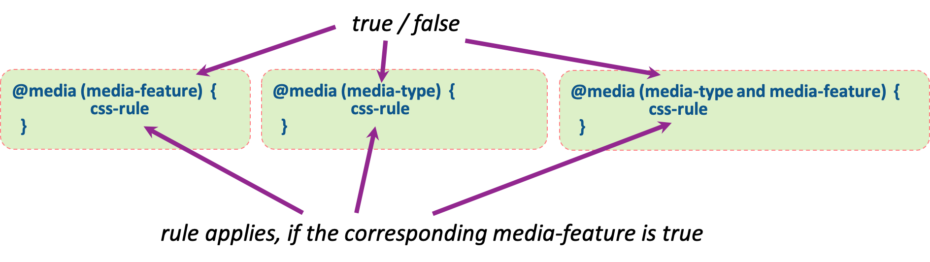
Media queries can be spotted by the use of the @ symbol. @media in CSS defines how CSS styles behave in specified media types and conditions. @media belongs to the so-called at-rules. The at-rules may be conditional, hence @media can also be conditional.
| Extra: Mozilla Developer Network - at-rules.
The rule is followed by media-queries, namely the conditions that specify when certain rules are to be applied. The query consists of either media-type (screen, paper, speech, or all), or certain display sizes, for example, min-width: 900px;. The queries are enclosed in parentheses and combine with and, or, not, and special only.
There's many rule options for media-features, including width, min-width, max-width, height, min-height, max-height, aspect-ratio, color, resolution, orientations, scan, etc.
What the media query rule does is quite easy to understand upon the first glimpse:
/* The following rules apply only when NOT using a small screen size */
@media (min-width: 768px)  { /* css-rule */ }

/* The following rules apply only when using a very specific screen size */
@media (min-width: 768px)  and (max-width: 991px) { /* css-rule */ }
There's also the media-type queries, such as all, aural, braille, handheld, print, projection, screen, TTY, TV, embossed, speech, etc., but you most likely will not use most of these very often. These are also easy to interpret upon reading them:
/* disable some graphics when printing the page, for example */
@media (print)  { /* css-rule */ }

/* we can get quite specific with these rules */
@media (min-width: 700px), handheld and (orientation: landscape) {  /* css-rule */ }
| Extra: Media queries in W3School.
Typically, media queries are used to define basic style rules and special style rules for certain screen widths. First, we define the rules that apply regardless of the window width, then with media queries, we change the basic style rules, or add new rules for certain situations. For example:
/* Remember, mobile first */
p {
    color: blue;
}

/* Remember, non-overlapping widths! */
@media (min-width: 1200px)  {
    /* rules for wide screens only */
}

@media (min-width: 992px) and (max-width: 1199px)  {
    /* rules for laptop sized screens */
}
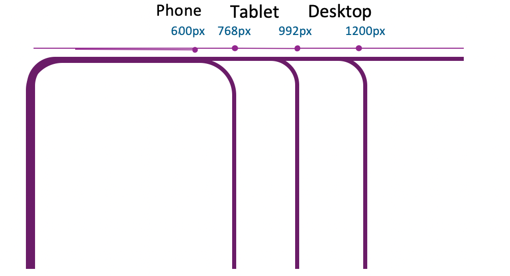
Here's a rough draft of typical viewport widths:
| Device type | Viewport widths |
|---|---|
| Small phone | < 600px |
| Phone | 600px - 767px |
| Tablet | 768px - 991px |
| Desktop | 992px - 1199px |
| Wide desktop | >= 1200px |
And here's the same with media queries:
/* Extra small devices (phones, 600px and down) */
@media only screen and (max-width: 600px) {...}

/* Small devices (portrait tablets and large phones, 600px and up) */
@media only screen and (min-width: 600px) {...}

/* Medium devices (landscape tablets, 768px and up) */
@media only screen and (min-width: 768px) {...}

/* Large devices (laptops/desktops, 992px and up) */
@media only screen and (min-width: 992px) {...}

/* Extra large devices (large laptops and desktops, 1200px and up) */
@media only screen and (min-width: 1200px) {...}
Why these exact values?
These five Typical Device Breakpoints are represented by W3Schools as a well-accepted de facto standard
Setting styles using JavaScript
In the previous chapter, we saw how we can alter the HTML DOM using JavaScript. We can also alter the visual appearance of nodes easily with the command document.getElementById(id).style.property = new style. For example:
Instead of changing elements CSS properties directly, you will most likely want to modify the classes of that element.
Modifying elements classList using JavaScript
Each element has a read-only classList property that returns a live collection of the class attributes of the element:
const elementsClasses = document.getElementById("my-id").classList;
Although the classList property is read-only, you can still use its methods add(), remove(), replace(), and toggle() to alter it. For example:
const btn = document.getElementById("my-button");
const modal = documment.getElementById("my-modal");

// toggle modal visibility
btn.addEventListener("click", function(event) {
    event.preventDefault();

    modal.classList.toggle("visible");
});

// toggle is the same as this
btn.addEventListener("click", function(event) {
    event.preventDefault();

    if(modal.classList.contains("visible")) {
        modal.classList.remove("visible");
    } else {
        modal.classList.add("visible");
    }
});
Multiple classes can be added or removed at once, for example: div.classList.add("foo", "bar", "baz");.
Accessibility
Equity of opportunities
Accessibility is important for giving everyone equal opportunities to access information. Formal organizations are mandated to follow the accessibility instructions and deliver the information in such a manner that everyone can read it; a few countries have even written this right to their law. Moreover, accessible sites tend to rank higher on search engines and be more usable overall.
W3C initiatives
Several specifications and projects target better accessibility for visually impaired people, such as Web Content Accessibility Guidelines, and WAI-ARIA of W3C. In addition, such open-source projects as A11y Project have joined the effort by crowd-sourcing more material, e.g., writing accessibility articles, editing inaccuracies, and providing high-level information. For more information, see https://a11yproject.com/.
A11y is the short form way of writing accessibility. It is known as a "numeronym", where 11 denotes the missing 11 letters between 'a' and 'y'.

Making HTML accessible
- Write HTML with accessibility in mind
- Provide the user a good way to navigate and interact with your site: the main things should be easily accessible
- Make your HTML code as semantic as possible so that the code is easy to understand for visitors and screenreaders
| Extra: Accessiblity at W3Schools.
Accessibility guidelines
Navigation with the keyboard should always be possible: the consistent order of switching focus, the most important first, no non-navigable parts.
When using screen readers, the correct use of different header levels is important.
The visual design of the web page is also important. Contrasts and colors should be thought about color-blind (and other) in mind.
Good validators for contrast and colors are:
- color contrast checker for low visibility and color blindness
- WAVE Web Accessibility evaluation tool - Firefox and Chrome plugin: Chrome plugin can be found here
- A whole page can be tested in browser here
Accessibility standards and tools
WAI-ARIA stands for “Web Accessibility Initiative – Accessible Rich Internet Applications”. See more from W3C.
Test with screenreaders
- NVDA (Windows, freeware)
- Jaws (Windows, commercial)
- VoiceOver (Apple)
- ChromeVox (Text-to-speech)
- TalkBack (Android)
- Orca (Linux)
- Survey about the current screen readers: https://webaim.org/projects/screenreadersurvey8/
Accessibility "linting" integrated with the toolchain
In the weekly exercises and assignment, we exploit various tools, such as plugins axes, pa11y, and a11y that are capable of checking both HTML and JavaScript, for example:
- alt-text: Enforce all elements that require alternative text have meaningful information to relay back to the end-user.
- anchor-is-valid: Enforce all anchors are valid, navigable elements.
- aria-props: Enforce all aria-* props are valid.
More information about the available rules checkable here.
Video: Bringing it all together
In this video, we will continue working with the form from the previous chapter. We'll style it a bit and make it responsive using mobile-first thinking.
Summary
CSS can be used to set the visual appearance of an HTML document. Today, the web is consumed most using mobile devices. This puts great importance on designing websites "mobile first". Elements can be targeted using tag, id, class, and pseudo-elements. Being too specific when using combinators can make it laborious to alter the HMTL structure later. Accessibility might not seem important when you can see OK, but it could make a huge difference when you can not.
Ask yourself
- Can you think of a case when it would make sense to use combinators and pseudo-elements together to style and when it would not make sense to use them?
- Do you understand the specificity formula and why some specifications override others?
- Do you understand the box model?
- When would you rather use Flexbox and when Grids?
- Do you know how to write media queries?
- Do you know how to modify elements' appearance and visibility using JavaScript?